Thumb-Friendly Mobile Navigation: Inclusive UX Feature
Finally, a thumb-friendly mobile navigation! BURIBA realized this is absolutely the UX feature that every left-handed or person with small hands was waiting for. Diversity and inclusion should be a standard in website and mobile application development too. The two most common expectations from a new website is to look innovative and be highly functional. […]
Finally, a thumb-friendly mobile navigation! BURIBA realized this is absolutely the UX feature that every left-handed or person with small hands was waiting for.
Diversity and inclusion should be a standard in website and mobile application development too.
The two most common expectations from a new website is to look innovative and be highly functional. In 2022, this is a very good base but not enough. Inclusion is key when it comes to UX design. Accessibility of web features should be related to all kinds of people including the left-handed ones too.
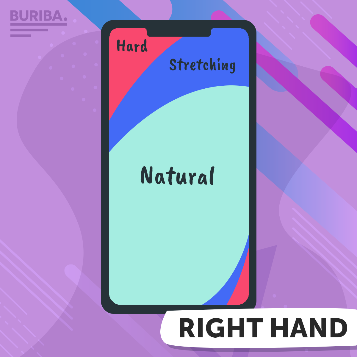
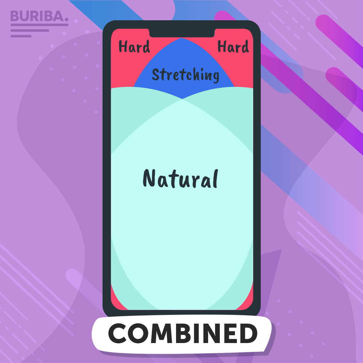
Think about how you use your smartphone. Which are the areas that it is comfortable to reach with your thumb or which are the ones where you have to stretch your finger or even to involve your other hand? When you are about the design the mobile version of your website or your mobile application always focus on the the center of the screen.
Thumb-friendly mobile navigation means to place the navigation bar, the menu, and the call-to-action buttons in the center of the phone screen where both of your thumbs – your left and right finger too – can reach them easily.
Here we created a guide for the thumb-friendly phone screen.